iCura
Project Context
-
iCura is an interactive desktop application tailored for nurses and healthcare professionals operating at the administrative level. Its primary function is to facilitate the creation, modification, and assessment of incident reports. The objective of the system is to enhance the efficiency of accessing and finalizing incident records, as well as to ensure precision in reviewing reports and adding supplementary case documentation.
-
Role
Time
UX reasearcher and designer
Mar 2024 - Apr 2024
Teammate
Tools
Mehdi Shah
Figma, Photoshop
-
Background
Design and develop a web-based incident reporting system specifically for nursing home settings. The system goals to improve the effectiveness for accessing and completing or submitting incident records, and accuracy for reviewing report and appending case documentation. It is also essential that this system expedites the reporting process and provides simple way to populate OSHA/ Workers Comp forms, and responsiveness of incident reporting processes including dashboard analytics to enhance resident safety and wellbeing.
Research
-
This project is focusing on external secondary research which involves gathering related information and insights from newspaper articles, research journals, case studies, open data repositories, internet searches, info from govt. sources, etc. The following research questions are being addressed during the secondary research:
-
Research Questions
- What is OSHA?
- What are OSHA violations?
- What are the OSHA forms and how does it look like?
- Who are the users?
- What different types of incidents are typically reported in nursing home settings?
- How is the current procedure to report the incident?
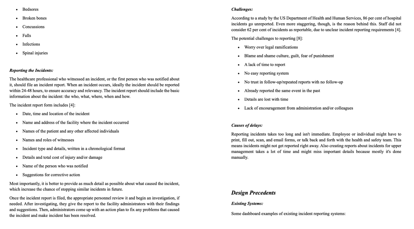
- What are the challenges in the existing reporting process?
- What are the main causes of delays in the reporting and resolving of incidents?
- What are the different kinds of reporting system currently using in nursing home settings?
- How are the features?
- What are the design guidelines should follow creating intuitive and user-friendly interfaces for incident reporting systems?
- What kind of data analytics and visuals need to incorporate with the system?
-
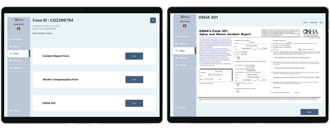
OSHA
The Occupational Safety and Health Administration (OSHA) assures safe and healthful working conditions by setting and enforcing standards, and by providing training, outreach, education, and assistance. OSHA Form 300, “Log of Work-Related Injuries and Illnesses” is used to classify work-related injuries and illnesses and to note the extent and severity of each case. When an incident occurs, use the Log to record specific details about what happened and how it happened. OSHA Form 301, “Injury and Illness Incident Report,” is used by employers to keep a record of a single injury, illness, or death in a workplace. This form is found within OSHA Form 300, which is used to log and classify all such incidents for a workplace. Each incident recorded on OSHA Form 300 must also be documented in greater detail on OSHA Form 301.

-
The users
The users of the incident reporting system in nursing home settings are primarily medical staff directly involved in or observing adverse events, such as nurse managers, front-line nurses, pharmacists, and physicians. According to The Joint Commission in the United States, nurses submit the highest number of incident reports. These individuals typically submit the majority of incident reports, as they are firsthand witnesses to incidents. However, an effective incident reporting system should allow anyone, including staff, patients, families, or visitors, to report incidents.
-
Incidents types
Incidents are typically categorized into three types
- Harmful Incidents:
Harmful incidents involve injury or illness to a patient or another individual. For example, a patient could fall out of bed and break their arm or scratch a nurse as she takes their temperature.
- Near Misses:
A near miss is when there was potential harm to a patient, or another person was almost harmed, but the situation was corrected before it occurred. For example, a patient might get caught trying to leave the facility prematurely or trip, but a nurse catches them before they fall.
- No-Harm Incidents:
A no-harm incident means that something happened to a patient or another person, but no discernible injury or illness resulted. For example, a patient could be given a blood transfusion meant for another patient, but no harm was done because the blood was compatible.
- Harmful Incidents:
-
Design Precedents
Designing web-based interfaces for incident reporting systems, it's essential to prioritize simplicity and ease of use. It's important to keep the process of reporting incidents is simple and straightforward. We need to make the reporting process clear, using intuitive language and step-by-step instructions. Then we need to organize the interface logically, with buttons and menus, and maintain consistency in design elements like colors and fonts. It is important to provide helpful documentation to guide users through the process, and also the interface has to be responsive.
-
Data analytics and visuals
To create an effective web-based incident reporting system for nursing homes, it's important to incorporate relevant data analytics and visuals.
- The system can include analytics to track key information such as incident frequency, types of incidents, and their severity levels.
- Visualizations such as charts and graphs can help users easily understand trends and patterns in incident data, and also assist in decision-making.
- Data visualizations can provide insights about incident locations and source easily which would help administrators to identify key resources.
- Trend analysis also can help predict potential incident risk and guide preventive measures.
Overall, integrating data analytics and visualizations into the system can enhance its effectiveness in identifying, addressing, and preventing incidents.
Design Process
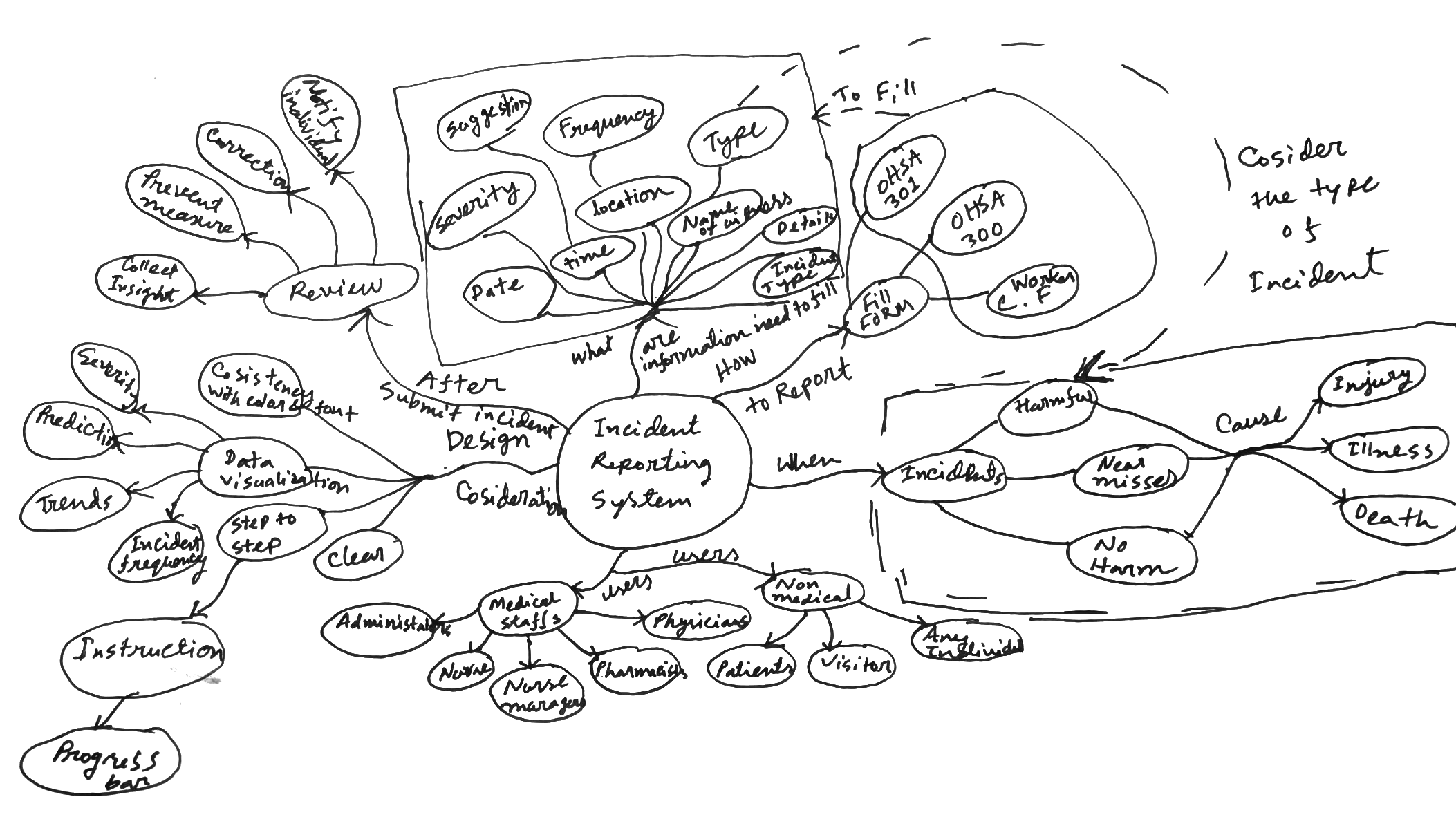
Based on the information collected from the secondary research, I built a concept map for an Error Reporting System project that encapsulates the various components and relationships central to the design. At its core, the concept map visualizes key elements which covers user interaction, focusing on the ease of use, submitting incident records, and accuracy for reviewing report and appending case documentation, input form and support for specifically for nursing home settings.
Ideation
-
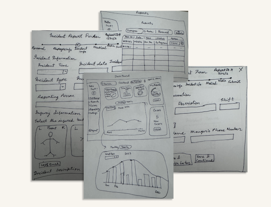
Sketches
In the ideation process we were developing, and refining ideas to address the user's needs and create an effective and delightful user experience that solves our users problem more effectively. Designing a new and innovative solution required us to brainstorm not only the design but how we would introduce this new flow to users. We explored different solutions and sketched out the user flows.
-
Digital Wireframes
-
As the initial design phase continued, we made sure to base screen designs on findings from the user research. Using the completed set of digital wireframes, then we created a low-fidelity prototype, so the prototype could be used in a usability study.
-
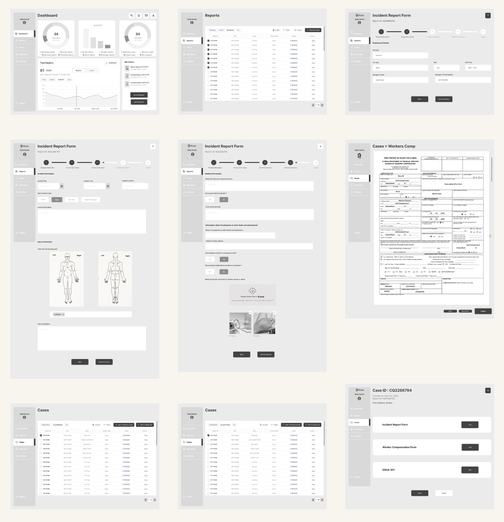
We conducted rounds of usability studies. Findings from the prototype testing helped us to guide the designs from wireframes to mockups. The testing study revealed what aspects of the mockups needed refining. Here are all the findings we got from usability studies:
1
Change the labeling order for Report tableChange the labeling order for both Report and Report table. The labeling were ordered (E.g. under review >Review> In progress > All), change it to - (All> under review >Review> In progress) which make it more understandable for user
2
Add OSHA 300 Buttons outside table area“Add OSHA 300” button and “View OSHA 300” both are under case table that confused user. So, we moved the “Add OSHA 300” button and “View OSHA 300” both button outside of the case table and make it more understandable for our users
3
Built out search functionUsers were confused by the search function being available to click on, but not interactable - a more obvious mock up of the true intentions of the search bar has been implemented
4
Built out Reminders functionThe new reminders function offer a quick reminder in the same window, and seeing the new reminder pop up
5
Change the labels for dashboardUser wanted the dashboard label more cleared since the they are send them to different pages. So, we changed two the labels - “View all” to “View Reports” and “View Cases”. So, now it is more clear for user where they’re heading
6
Add Report Buttons outside table areaChange the labeling order for both Report and Report table. The labeling were ordered (E.g. under review >Review> In progress > All), change it to - (All> under review >Review> In progress) which make it more understandable for user
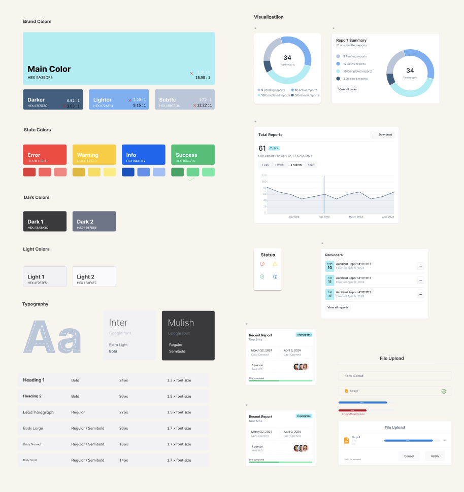
Style Sheet
Final Design
-
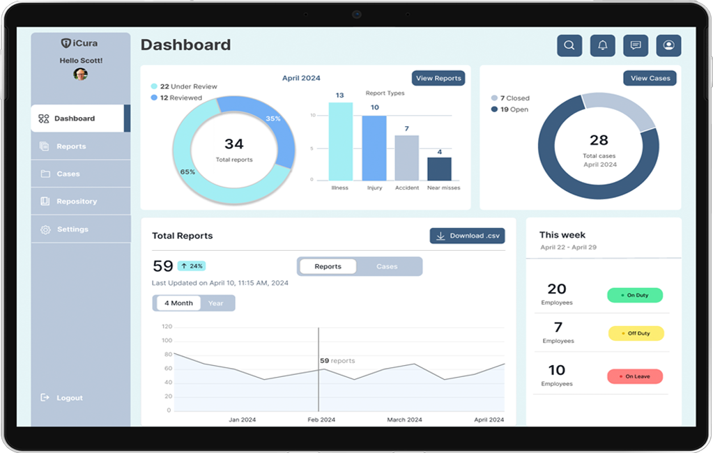
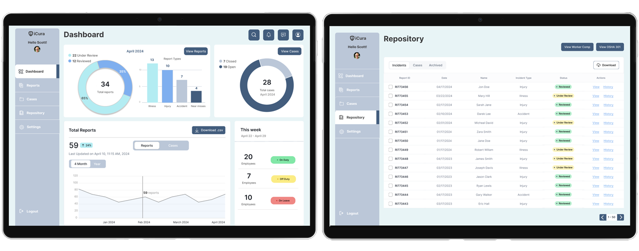
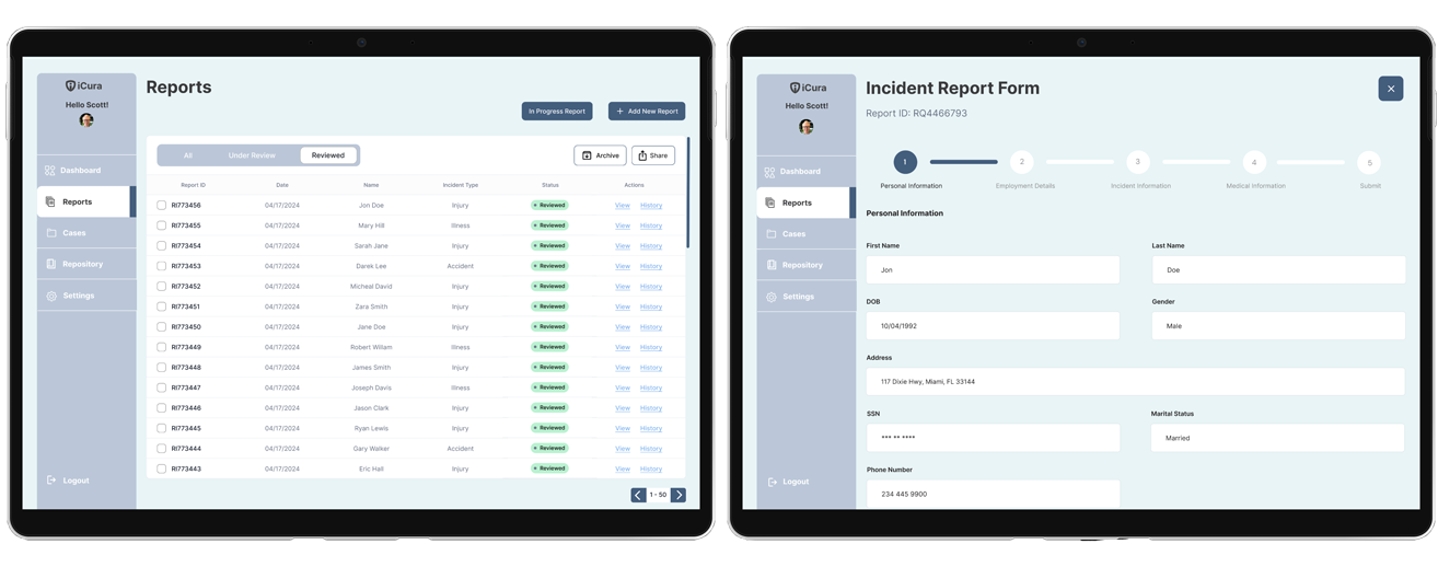
Our final design encompassed the opportunity areas – analytics to track key information such as incident frequency, types of incidents, and straightforward navigation, as well as to make the reporting process clear, we used intuitive language, clear labeling, confirmation pop up and step-by-step instructions.
-
-
-
Reflection
-
Impact
We tried to select elements that align with the project's goals. The icons and elements were used that familiar and match with the real world. And we also maintained consistency with the design for the whole system, so that it looks visually appealing and more user friendly.
-
What I learned
The biggest challenge designing this intricated system was to provide an easy navigation and system clarification. To ensure that I used a progress bar, confirmation pop up and simple and minimalist layout.